Illustration
Bumi uses isometric 3D illustrations with warm earth tones. They add personality to otherwise data-heavy screens and reinforce the Indonesian retail context.
Style
All illustrations share a consistent isometric 3D style:
- Perspective: Isometric (no vanishing point)
- Line work: Clean vector, no hand-drawn effects
- Color: Earth tone palette (see below)
- Lighting: Soft, diffuse --- no harsh shadows
- Detail level: Medium --- recognizable but not photorealistic
Color Palette for Illustrations
| Color | Hex | Role |
|---|---|---|
| Forest Green | #2D6B4A | Primary accent, branding elements |
| Warm Sand | #C4A882 | Secondary surfaces, backgrounds |
| Muted Sage | #8B9D7A | Foliage, organic elements, secondary accent |
| Warm Cream | #F5F3ED | Light surfaces, paper, screens |
| Dark Charcoal | #1F2329 | Outlines, dark surfaces, text on illustrations |
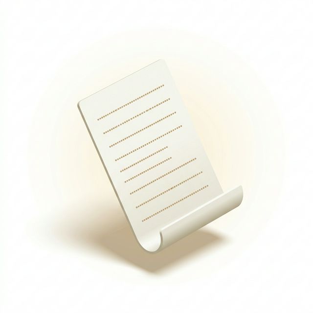
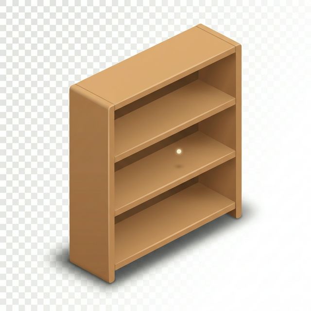
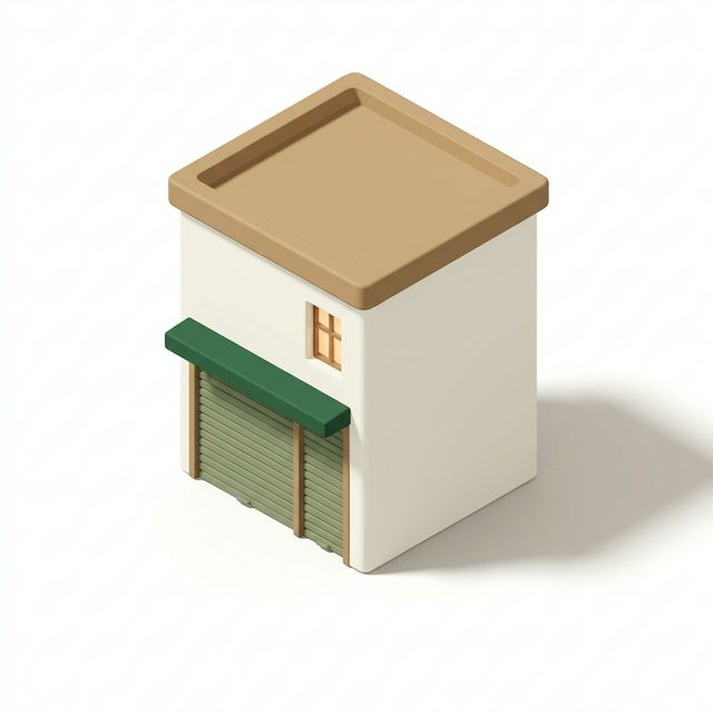
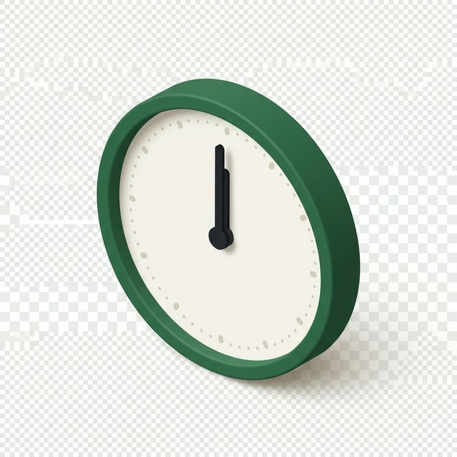
Generated Illustrations (26/67)
Illustrations generated with Gemini using the Bumi isometric style. Green border = ready, dashed border = still generating.
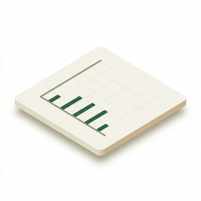
Empty States (14/14 done)
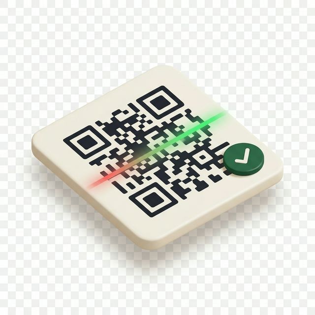
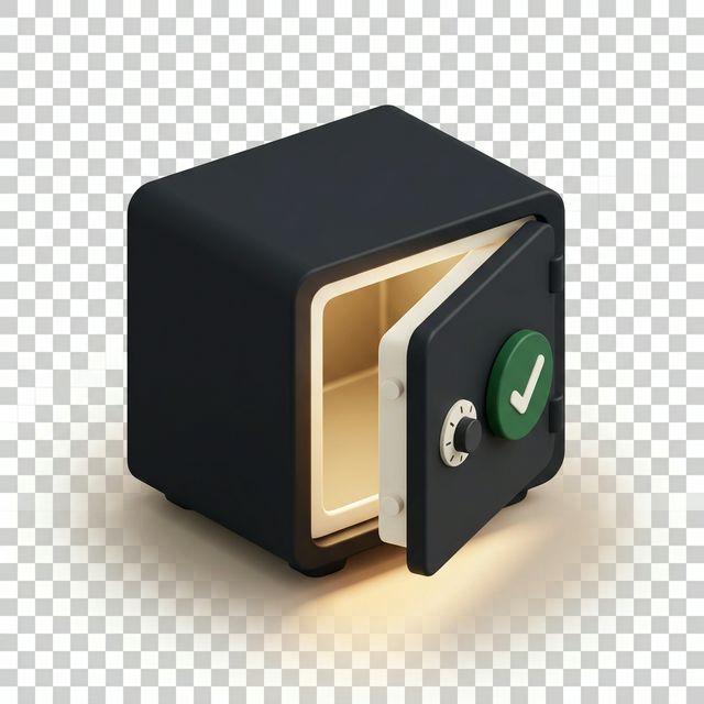
Success States (7/7 done)


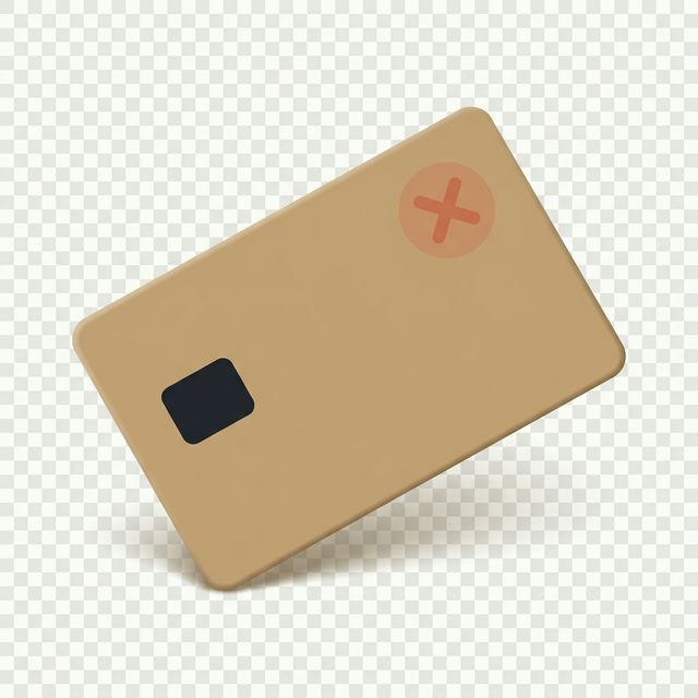
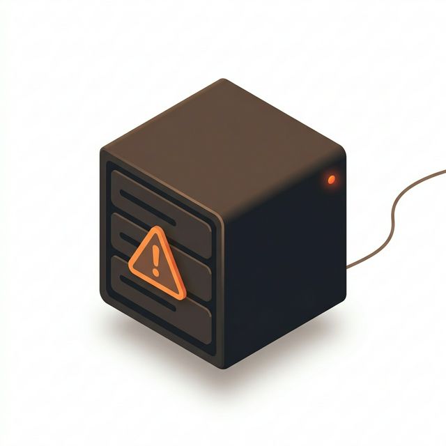
Error States (5/7 done)


Remaining Categories (0/41 — Generating)
docs/public/illustrations/ and they will appear here automatically.24px
48px
80px
120px
Usage Categories
| Category | Where Used | Examples |
|---|---|---|
| Empty states | When a list or page has no data | Empty transaction list, no members found |
| Success | Completion confirmations | Order placed, shift closed, sync complete |
| Error | Error and failure screens | Connection lost, sync failed |
| Devices | Hardware representation | POS terminal, barcode scanner, printer |
| Features | Feature introduction cards | New loyalty program, RFID scanning |
| Modals | Modal header decorations | Welcome modal, onboarding steps |
| Banners | Full-width page banners | Dashboard header, seasonal promotions |
Size Guide
| Token | Dimensions | Usage |
|---|---|---|
| Micro | 24px | Inline with text, list item decoration |
| Icon | 48px | Small feature cards, list headers |
| Medium | 80px | Empty state illustrations (compact) |
| Large | 120px | Empty state illustrations (standard) |
| Modal Header | 200 x 100px | Top of modal dialogs |
| Banner | 800 x 200px | Page-wide banner illustrations |
Dark Mode
Illustrations use the same assets in dark mode. Before shipping, verify:
- Light-colored elements (
#F5F3ED) still have sufficient contrast against dark backgrounds - Dark outlines (
#1F2329) are adjusted to a lighter value if they disappear - Overall illustration does not appear "muddy" on dark surfaces
TIP
If an illustration looks wrong in dark mode, create a variant with adjusted light/dark values rather than adding a glow or outline effect.
Naming Convention
{category}-{name}.svg

Examples:
empty-transactions.svg
empty-members.svg
success-order-placed.svg
error-connection-lost.svg
device-pos-terminal.svg
device-barcode-scanner.svg
feature-loyalty-program.svg
banner-dashboard-header.svg
File Format
- Source format: SVG (vector, scalable)
- Optimization: Run through SVGO before committing
- Storage:
/public/illustrations/in each app - Import: Use as React components via bundler SVG loader or as
<img>tags
// As image
<img
  src="/illustrations/empty-transactions.svg"
  alt="No transactions yet"
  width={120}
  height={120}
/>

// As React component (with bundler support)
import EmptyTransactions from '@/illustrations/empty-transactions.svg';
<EmptyTransactions className="w-[120px] h-[120px]" />
Illustration Prompt Library
For generating new illustrations with AI tools or briefing illustrators, refer to the full prompt library at ILLUSTRATION_PROMPTS.md in the design assets repository. Each prompt specifies the exact isometric angle, color codes, and subject matter for consistency.
DO and DON'T
DO
- Use illustrations for empty states --- they soften the "nothing here" message
- Keep illustrations at the specified size tokens --- don't stretch or scale arbitrarily
- Use the five-color palette consistently across all illustrations
- Optimize SVGs before committing (SVGO)
DON'T
- Don't use stock illustrations or generic clip art --- they break the Bumi aesthetic
- Don't use illustrations larger than 200px in height for inline content
- Don't add text inside illustrations --- text should be in the DOM for accessibility and i18n
- Don't use photographs --- Bumi is a vector illustration system